Futura x Paul Renner
This project aims to pay homage to the renowned font »Futura« and its creator, Paul Renner, through the development of two augmented reality posters. These posters are designed to be experienced using Artivive, providing viewers with an interactive and immersive way to appreciate the posters' intricate layers.
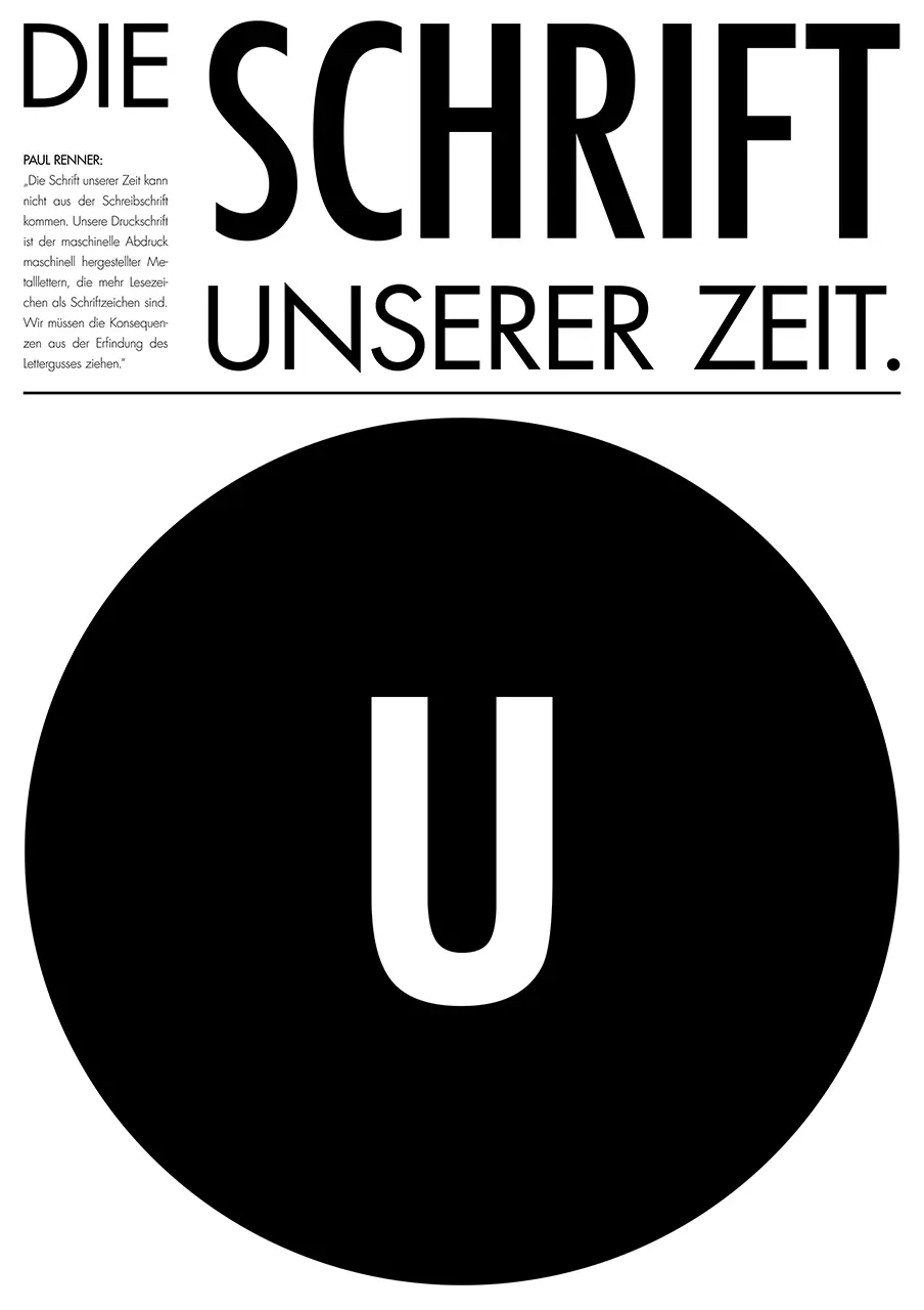
The »Futura« poster showcases the typeface's symmetrical and timeless design in detail, enabling viewers to comprehend Renner's vision of the »Futura« as »the font of our time« back in 1927. It features a circular disc that displays different letters with varying font weights, spinning on both the vertical and horizontal axis to highlight the unique symmetric properties of the font. This allows viewers to observe how most of the letters remain perfectly balanced, even when flipped around.
The Renner poster sheds light on the conflict between Paul Renner and the National Socialist Party in Germany. The poster resembles an old digital device recharging its batteries before scanning another part of Renner's article from the »Gebrauchsgraphik« magazine in 1933, in which he expresses his criticism of the »new typography« and the »new functional style« of the National Socialists. The computer screen-like window on top of the poster displays the heads of Renner and Paul Schultze-Naumburg clashing into each other, further highlighting the conflict. Paul Schultze-Naumburg was a national socialist and important art theorist at the time. Renner started off his conflict with the Nazis by contradicting a lecture of Naumburg with the publication of his pamphlet »Kulturbolschewismus?« in 1932.
Check out the posters' augmented reality layers by using Artivive.
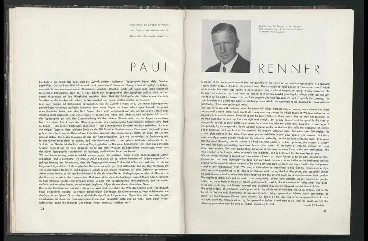
Renner's article in the »Gebrauchsgraphik« (January 1933).
Renner's article in the »Gebrauchsgraphik« (January 1933).